ToB企服应用市场:ToB评测及商务社交产业平台
标题:
【学习笔记】WPF快速入门:布局
[打印本页]
作者:
民工心事
时间:
2022-8-31 13:41
标题:
【学习笔记】WPF快速入门:布局
布局(Panel族)
WPF布局使用的是Panel族布局控件,它们均派生自Panel抽象类,主要用于控制UI布局。
WPF布局容器
WPF常用的布局容器及使用方法如下:
Grid
网格,类似table表格,可灵活设置行列并放置控件元素,比较常用
Grid的使用思路
- 声明Grid容器
<Grid></Grid>
- 定义行列属性
<Grid.ColumnDefinitions>
<ColumnDefinition>
</Grid.ColumnDefinitions>
<Grid.RowDefinitions>
<RowDefinition>
</Grid.RowDefinitions>
- 使用网格单元
<ControlName Grid.Column="0" Grid.Row="0"/>
复制代码
四种行列高宽设置
Auto:根据网格单元内容自动设置大小
数值:直接设置网格单元大小
数值*:剩余部分按比例分配大小
默认值:默认为1*
Gird布局练习
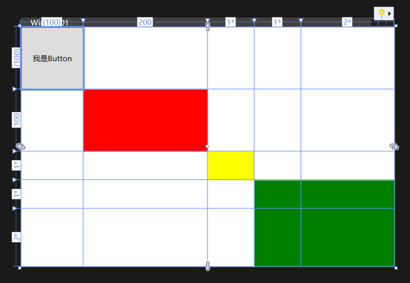
<Grid>
<Grid.ColumnDefinitions>
<ColumnDefinition Width="Auto"/>
<ColumnDefinition Width="200"/>
<ColumnDefinition/>
<ColumnDefinition Width="1*"/>
<ColumnDefinition Width="2*"/>
</Grid.ColumnDefinitions>
<Grid.RowDefinitions>
<RowDefinition Height="Auto"/>
<RowDefinition Height="100"/>
<RowDefinition/>
<RowDefinition Height="1*"/>
<RowDefinition Height="2*"/>
</Grid.RowDefinitions>
<Button Grid.Column="0" Grid.Row="0" Content="我是Button" Width="100" Height="100"/>
<Border Grid.Column="1" Grid.Row="1" Background="Red"/>
<Border Grid.Column="2" Grid.Row="2" Background="Yellow"/>
<Border Grid.Column="3" Grid.Row="3" Grid.ColumnSpan="6" Grid.RowSpan="2" Background="Green"/>
</Grid>
复制代码
备注:
WPF的分辨率无关性
WPF程序中的单位是与设备无关的单位,每个单位是1/96英寸,如果电脑的DPI设置为96(每个英寸96个像素),那么此时每个WPF单位对应一个像素,不过如果电脑的DPI设备为120(每个英寸120个像素),那此时每个WPF单位对应应该是120/96=1.25个像素,也就是说WPF中的控件在不同分辨率的情况下会自动调整,使用不同的像素点渲染,以适应屏幕显示。
StackPanel
栈式面板,水平或垂直排列元素,移除一个元素后,后面的元素自动向前填补空缺,Orientation属性: Horizontal / Vertical
StackPanel的使用思路
- 确定是否需要堆栈式布局,确定布局采用横排还是竖排
- 声明StackPanel容器
- 设置StackPanel属性,Orientation横排还是竖排,HorizontalAlignment、VerticalAlignment对齐方式
- 填充StackPanel容器内容
复制代码
StackPanel布局练习
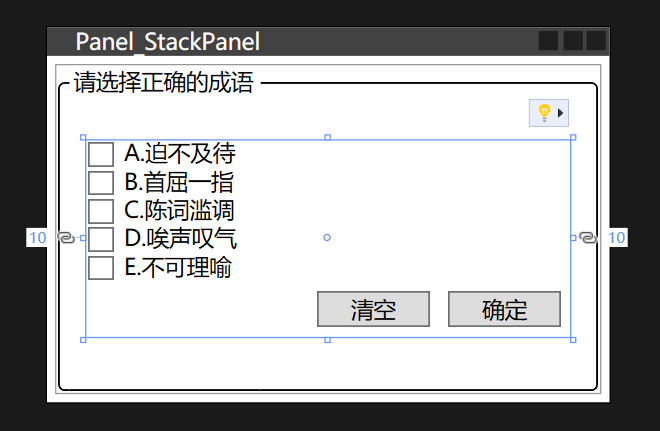
<GroupBox Header="请选择正确的成语" BorderBrush="Black" Margin="5">
<StackPanel Orientation="Vertical" Margin="10" VerticalAlignment="Center">
<CheckBox Content="A.迫不及待"/>
<CheckBox Content="B.首屈一指"/>
<CheckBox Content="C.陈词滥调"/>
<CheckBox Content="D.唉声叹气"/>
<CheckBox Content="E.不可理喻"/>
<StackPanel Orientation="Horizontal" HorizontalAlignment="Right">
<Button Content="清空" Width="60" Margin="5"/>
<Button Content="确定" Width="60" Margin="5"/>
</StackPanel>
</StackPanel>
</GroupBox>
复制代码
WrapPanel
自动折行面板,水平或垂直排列元素、如果剩余空间不足,排不下的控件会自动换行或换列进行排列,新起一行或一列继续排列
WrapPanel的使用思路
- 确定是否需要流式布局,确定布局采用横排还是竖排
- 声明WrapPanel容器
- 设置WrapPanel属性,Orientation横排还是竖排,HorizontalAlignment、VerticalAlignment对齐方式
- 填充WrapPanel容器内容
复制代码
WrapPanel布局练习
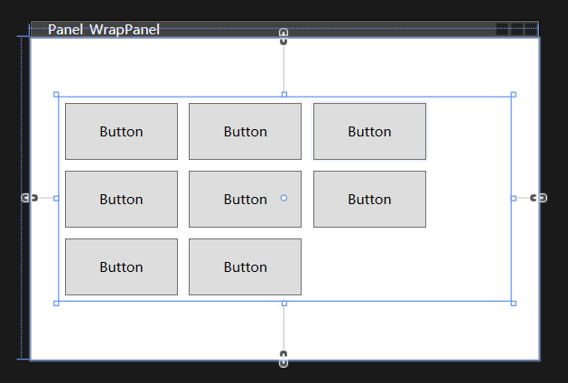
<WrapPanel Width="400" Orientation="Horizontal" HorizontalAlignment="Center" VerticalAlignment="Center">
<Button Width="100" Height="50" Content="Button" Margin="5"/>
<Button Width="100" Height="50" Content="Button" Margin="5"/>
<Button Width="100" Height="50" Content="Button" Margin="5"/>
<Button Width="100" Height="50" Content="Button" Margin="5"/>
<Button Width="100" Height="50" Content="Button" Margin="5"/>
<Button Width="100" Height="50" Content="Button" Margin="5"/>
<Button Width="100" Height="50" Content="Button" Margin="5"/>
<Button Width="100" Height="50" Content="Button" Margin="5"/>
</WrapPanel>
复制代码
DockPanel
泊靠式面板, 根据容器的边界、元素进行Dock.Top、Left、Right、Bottom锚定设置
DockPanel的使用思路
- 确定是否需要流式布局,确定布局采用横排还是竖排
- 声明DockPanel容器
- 设置DockPanel属性,HorizontalAlignment、VerticalAlignment对齐方式
- 填充DockPanel容器内容
复制代码
DockPanel布局练习
<WrapPanel Width="400" Orientation="Horizontal" HorizontalAlignment="Center" VerticalAlignment="Center">
<Button Width="100" Height="50" Content="Button" Margin="5"/>
<Button Width="100" Height="50" Content="Button" Margin="5"/>
<Button Width="100" Height="50" Content="Button" Margin="5"/>
<Button Width="100" Height="50" Content="Button" Margin="5"/>
<Button Width="100" Height="50" Content="Button" Margin="5"/>
<Button Width="100" Height="50" Content="Button" Margin="5"/>
<Button Width="100" Height="50" Content="Button" Margin="5"/>
<Button Width="100" Height="50" Content="Button" Margin="5"/>
</WrapPanel>
复制代码
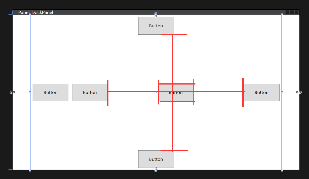
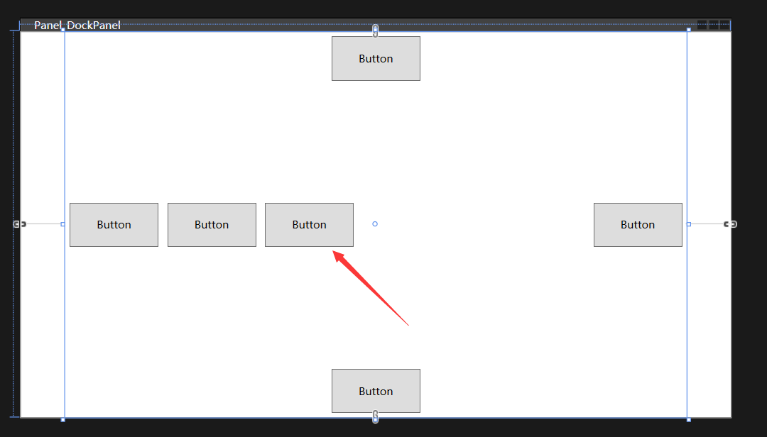
<DockPanel Width="700" HorizontalAlignment="Center" LastChildFill="False">
<Button DockPanel.Dock="Top" Width="100" Height="50" Content="Button" Margin="5"/>
<Button DockPanel.Dock="Bottom" Width="100" Height="50" Content="Button" Margin="5"/>
<Button DockPanel.Dock="Left" Width="100" Height="50" Content="Button" Margin="5"/>
<Button DockPanel.Dock="Right" Width="100" Height="50" Content="Button" Margin="5"/>
<Button Width="100" Height="50" Content="Button" Margin="5"/>
<Button Width="100" Height="50" Content="Button" Margin="5"/>
</DockPanel>
复制代码
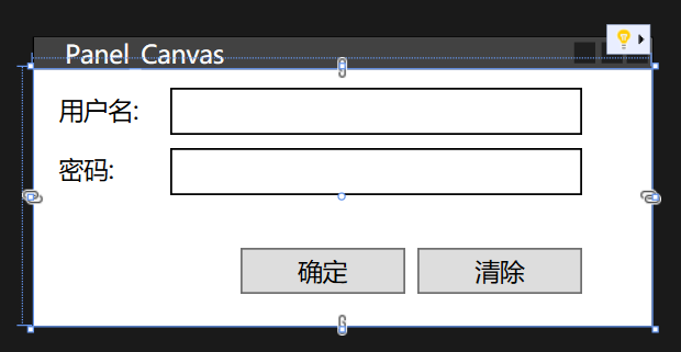
Canvas
画布,内部元素可使用以像素为单位的绝对坐标进行定位,使用固定的坐标设置元素的位置、不具备锚定停靠等功能。
Canvas适用场合
● 一经设计基本上不会再有改动的小型布局(如图标)。
● 艺术性比较强的布局。
● 需要大量使用横纵坐标进行绝对点定位的布局。
● 依赖于横纵坐标的动画。
Canvas的使用思路
- 确定是否需要Canvas画布布局
- 声明Canvas容器
- 填充Canvas容器内容
- 设置内容属性,Canvas.Left、Canvas.Top
复制代码
Canvas布局练习
<DockPanel Width="700" HorizontalAlignment="Center" LastChildFill="False">
<Button DockPanel.Dock="Top" Width="100" Height="50" Content="Button" Margin="5"/>
<Button DockPanel.Dock="Bottom" Width="100" Height="50" Content="Button" Margin="5"/>
<Button DockPanel.Dock="Left" Width="100" Height="50" Content="Button" Margin="5"/>
<Button DockPanel.Dock="Right" Width="100" Height="50" Content="Button" Margin="5"/>
<Button Width="100" Height="50" Content="Button" Margin="5"/>
<Button Width="100" Height="50" Content="Button" Margin="5"/>
</DockPanel>
复制代码
免责声明:如果侵犯了您的权益,请联系站长,我们会及时删除侵权内容,谢谢合作!
欢迎光临 ToB企服应用市场:ToB评测及商务社交产业平台 (https://dis.qidao123.com/)
Powered by Discuz! X3.4