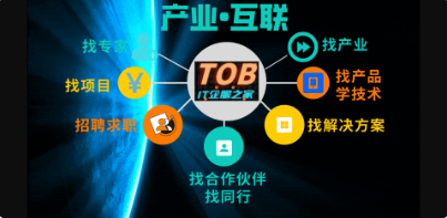
【HarmonyOS 5.0】第十二篇-ArkUI公共属性(一)

打印 上一主题 下一主题

主题 1033|帖子 1033|积分 3099

一、公共样式类属性

ArkUI框架提供的基础组件直接或者间接的继承自 CommonMethod , CommonMethod 中定义的属性样式属于公共样式。下面就来学习这些样式
1.1.尺寸设置


  • 宽高设置
设置组件的宽高,缺省时使用组件自身内容的宽高,比如充满父布局可以使用 string 值:“100%”,当组件同时设置 size 和 width / height 时,以最后设置的值为准。
  1. @Entry
  2. @Component
  3. struct TextExample {
  4.   build() {
  5.     Column({space:10}){
  6.       Text()
  7.         .size({width:220, height:25}) //设置宽高
  8.         .width(120)                   //设置宽度,会覆盖上面的宽度
  9.         .height(25)                   //设置高度,会覆盖上面的高度
  10.         .backgroundColor("#8EE5EE")   //设置背景色
  11.       Text()
  12.         .width("100%")                //设置宽度
  13.         .height(10)                   //设置高度
  14.         .backgroundColor("#CD5555")   //设置背景色
  15.       Text()
  16.         .width(200)                   //设置宽度
  17.         .height(200)                  //设置宽度
  18.         .size({width:120, height:25}) //设置宽高、覆盖前边的值
  19.         .backgroundColor("#8B0000")   //设置背景
  20.     }
  21.     .size({width:"100%", height:"100%"})
  22.   }
  23. }
复制代码
预览效果如下:

如果子组件的宽高大于父组件的宽高,默认情况下子组件会绘制出父组件的可视范围,此时可以设置 clip(true) 方法限定子组件超出父组件的范围,样比方下所示:
  1. @Entry
  2. @Component
  3. struct TextExample02 {
  4.   build() {
  5.     Column({space:50}){
  6.       Column(){
  7.         Text("高度超出父组件")
  8.           .width(120)
  9.           .height(120) //高度超出父组件
  10.           .fontColor(Color.White)
  11.           .backgroundColor("#00EE76")
  12.       }
  13.       .width(300)
  14.       .height(100)
  15.       .backgroundColor("#8B8386")
  16.       Column(){
  17.         Text("高度超出父组件")
  18.           .width(120)
  19.           .height(120)
  20.           .fontColor(Color.White)
  21.           .backgroundColor("#8B7E66")
  22.       }
  23.       .width(300)
  24.       .height(100)
  25.       .backgroundColor("#FF6A6A")
  26.       .clip(true) // 设置父组件对于超出范围的子组件做剪切处理
  27.     }
  28.     .width("100%")
  29.     .height("100%")
  30.     .padding(20)
  31.   }
  32. }
复制代码
预览效果如下:


  • 宽高比设置
设置组件的宽高比:aspectRatio = width / height,在设备适配上比力实用。
  1. @Entry
  2. @Component
  3. struct AspectRationExample {
  4.   build() {
  5.     Column({space:10}){
  6.       Row({space:10}){
  7.         //1:1
  8.         Text().width(50).height(50).backgroundColor("#FF4040")
  9.         //1:1
  10.         Text().width(50).backgroundColor("#FF4040").aspectRatio(1) //设置宽高比
  11.         //1.5:1
  12.         Text().width(50).backgroundColor("#FF4040").aspectRatio(1.5) //设置宽高比
  13.         // 0.5:1 = 50: 100
  14.         Text().width(50).backgroundColor("#FF4040").aspectRatio(0.5) //设置宽高比
  15.         //和上面的效果一样
  16.         //Text().width(50).height(100).backgroundColor("#FF4040")
  17.         // 宽和高的比例,50:100, 宽是高的0.5倍
  18.         Text().height(100).backgroundColor("#FF4040").aspectRatio(0.5)
  19.       }
  20.       .padding(10).size({width:"100%", height:120})
  21.     }
  22.     .padding(10)
  23.     .size({width:"100%", height:"100%"})
  24.   }
  25. }
复制代码
预览效果如下:


  • 边距设置
盒模型作为前端布局中最简单,也最重要的一项布局方式,CSS盒模型本质上是一个盒子,封装四周的HTML元素,它包括:外边距(margin)、边框(border)、内边距(padding)、现实内容(content)四个属性。CSS盒模型:标准模型 + IE模型

盒模型包括:


  • 内容(content):元素中显示的文本,图片等现实内容。
  • 内边距(padding):内容和边框之间的空白地区。
  • 边框(border):围绕内容和内边距的线条或图案。
  • 外边距(margin):边框和其他元素之间的空白地区。
标准模型和IE模型的区别盘算宽度和高度的不同:


  • 标准盒模型:盒子总宽度/高度 = width/height + padding + border + margin。( 即 width/height 只是内容高度,不包含 padding 和 border 值 )
  • IE盒子模型:盒子总宽度/高度 = width/height + margin = (内容区宽度/高度 + padding + border) + margin。( 即 width/height 包含了 padding 和 border 值 )
在HarmonyOS4.0中,盒模型也是雷同的,代码如下
  1. @Entry
  2. @Component
  3. struct BoxExample {
  4.   build() {
  5.     Row(){  // 创建一个水平布局的Row组件
  6.       Text("盒子模型")  // 显示文本内容为“盒子模型”
  7.         .height("100vp")  // 设置高度为视口宽度的百分之百
  8.         .width("100vp")  // 设置宽度为视口宽度的百分之百
  9.         .margin({left:"10vp", top:"30vp", right:"50vp", bottom:"70pv"})  // 设置外边距
  10.         .border({width:"10px", style: BorderStyle.Solid, color: "#0000ff"})  // 设置边框样式
  11.         .padding(30)  // 设置内边距
  12.         .backgroundColor("#00ff00")  // 设置背景颜色为绿色
  13.         .textAlign(TextAlign.Center)  // 设置文本水平居中对齐
  14.     }.backgroundColor("#ff0000")  // 设置Row组件的背景颜色为红色
  15.   }
  16. }
复制代码
预览效果如下:

在双向预览中检察盒模型构成,如下:

设置组件的内边距/外边距,当只设置一个值时表示对四个方向的边距同时见效;参数类型为 Padding / Margin 时,可单独设置边距,若设置为百分比时,上下左右表里距均以父容器的 width 作为基础值。案例代码如下:
  1. @Entry
  2. @Component
  3. struct BoxExample02 {
  4.   build() {
  5.     Row(){
  6.       Column(){
  7.         Row(){
  8.           Text()
  9.             .width("100%")               //设置宽度充满父组件
  10.             .height("100%")              //设置高度充满父组件
  11.             .backgroundColor("#EE799F")  //设置背景色
  12.         }
  13.         .padding(20)                    //设置四个边距
  14.         .backgroundColor("#FFF0F5")     //设置背景色
  15.         .size({width:80, height:80})    //设置宽和高尺寸
  16.         Row(){
  17.           Text()
  18.             .width("100%")                              //设置宽度充满父组件
  19.             .height("100%")                             //设置高度充满父组件
  20.             .backgroundColor("#EE799F")                 //设置背景色
  21.         }
  22.         .padding({left:5, top: 20, right:5,bottom:20})  //设置四个边距
  23.         .backgroundColor("#FFF0F5")                     //设置背景色
  24.         .size({width:80, height:80})                    //设置宽和高尺寸
  25.         .margin(30)                                     //设置外边距,否则两个Row容器会挤在一起
  26.       }
  27.       .size({width:"100%",height:"100%"})
  28.       .backgroundColor("#54FF9F")
  29.     }
  30.   }
  31. }
复制代码
预览效果如下:


  • 权重设置
设置组件的布局权重,该属性仅在 Row、Column、Flex 布局中见效,表示在父容器主轴方向上的尺寸按照权重比进行分配,默认值为 0。
  1. @Entry
  2. @Component
  3. struct WeightSettings {
  4.   build() {
  5.     Column({space:20}){
  6.       Row(){ //下面两个Text子组件全都设置了权重,则子组件的宽度按照权重比例分配
  7.         Text()
  8.           .height(30)
  9.           .backgroundColor("#F4A460")
  10.           .layoutWeight(1)
  11.         Text()
  12.           .height(30)
  13.           .backgroundColor("#5F9EA0")
  14.           .layoutWeight(1)
  15.       }
  16.       Row(){ //子组件全都设置了权重,则子组件的宽度按照权重比例分配,子组件设置的宽度无效
  17.         Text()
  18.           .width(80)
  19.           .height(30)
  20.           .backgroundColor("#F4A460")
  21.           .layoutWeight(1)
  22.         Text()
  23.           .width(150)
  24.           .height(30)
  25.           .backgroundColor("#5F9EA0")
  26.           .layoutWeight(1)
  27.       }
  28.       Row(){ // 除去无权重子组件的宽度,剩余子组件的宽度按照权重比例分配
  29.         Text()
  30.           .width(150)
  31.           .height(30)
  32.           .backgroundColor("#228B22")
  33.         Text()
  34.           .width(150)
  35.           .height(30)
  36.           .backgroundColor("#F4A460")
  37.           .layoutWeight(1)
  38.         Text()
  39.           .width(120)
  40.           .height(30)
  41.           .backgroundColor("#5F9EA0")
  42.           .layoutWeight(2)
  43.       }
  44.     }
  45.     .size({width:"100%", height:"100%"})
  46.     .padding({top:20, bottom:20})
  47.   }
  48. }
复制代码
本样例中, Row 的每个子组件都设置了权重为 1 ,表示均分父组件的宽度,此时子组件设置的 width 是不起作用的,样例运行结果如下图所示:预览效果如下:


  • 尺寸束缚
设置组件的束缚尺寸从而在组件布局时对其尺寸进行限定,constraintSize() 的优先级高于 width() 和 height(),若设置的 minWidth 大于 maxWidth,则 minWidth 见效,minHeight 与 maxHeight 同理。
  1. @Entry
  2. @Component
  3. struct SizeConstraints {
  4.   build() {
  5.     Column({space:20}){
  6.       Text() // 目标参照组件
  7.         .width(220)
  8.         .height(40)
  9.         .backgroundColor("#aabbcc")
  10.       Text() // 设置约束尺寸
  11.         .width(220)
  12.         .height(40)
  13.         .constraintSize({
  14.           minWidth: 120,
  15.           minHeight: 20
  16.         })
  17.         .backgroundColor("#bbccaa")
  18.       Text() // 设置过最大约束尺寸,实际宽和高超过了,则按照约束显示
  19.         .width(220)
  20.         .height(40)
  21.         .constraintSize({
  22.           maxWidth: 120,
  23.           maxHeight: 20
  24.         })
  25.         .backgroundColor("#bbccaa")
  26.     }
  27.     .size({width:"100%",height:"100%"})
  28.   }
  29. }
复制代码
预览效果如下:

1.2.位置设置


  • 对齐方式
设置元素内容的对齐方式,当设置的 width 和 height 大小凌驾元素自己内容大小时见效。
  1. @Entry
  2. @Component
  3. struct PositionSetting {
  4.   build() {
  5.     Column({space:20}){
  6.       Text("align")  //默认样式
  7.         .fontSize(20)
  8.         .backgroundColor("#90EE90")
  9.       Text("align")  //组件尺寸默认等于内容尺寸
  10.         .fontSize(20)
  11.         .backgroundColor("#90EE90")
  12.         .align(Alignment.TopStart) //组件尺寸默认等于内容尺寸,不符合要求
  13.       Text("align")
  14.         .fontSize(20)
  15.         .backgroundColor("#90EE90")
  16.         .align(Alignment.TopStart)        //设置内容对齐方式
  17.         .size({width: 200, height: 60})   //组件尺寸大于内容尺寸,符合条件
  18.     }
  19.     .size({width:"100%", height:"100%"})
  20.     .padding(20)
  21.   }
  22. }
复制代码
预览效果如下:


  • 布局方向
设置子组件在程度方向上的布局方式,Direction 定义了一下 3 种布局方式:


  • Ltr:元素从左到右布局。
  • Rtl:元素从右到左布局。
  • Auto(默认值):使用体系默认布局方向。
案例代码如下:
  1. @Entry
  2. @Component
  3. struct DirectionExample {
  4.   build() {
  5.     Column({space:20}){
  6.       Row({space:10}){ //不设置子组件的对齐方式时采用默认值
  7.         Text("1").height(50).width("25%").fontSize(18).backgroundColor("#AABBCC")
  8.         Text("2").height(50).width("25%").fontSize(18).backgroundColor("#8B658B")
  9.         Text("3").height(50).width("25%").fontSize(18).backgroundColor("#008B8B")
  10.       }
  11.       .width("90%")
  12.       .backgroundColor("#E0FFFF")
  13.       Row({space:10}){ //不设置子组件的对齐方式时采用默认值
  14.         Text("1").height(50).width("25%").fontSize(18).backgroundColor("#AABBCC")
  15.         Text("2").height(50).width("25%").fontSize(18).backgroundColor("#8B658B")
  16.         Text("3").height(50).width("25%").fontSize(18).backgroundColor("#008B8B")
  17.       }
  18.       .width("90%")
  19.       .backgroundColor("#E0FFFF")
  20.       .direction(Direction.Rtl)
  21.     }
  22.     .width('100%')
  23.     .height("100%")
  24.     .padding(20)
  25.   }
复制代码
预览效果如下:


  • 绝对定位
设置当前组件在父组件中的位置,参照点为父容器顶点位置。在布局容器中,设置该属性不影响父容器布局,仅在绘制时进行位置调整。
  1. @Entry
  2. @Component
  3. struct DirectionExample {
  4.   build() {
  5.     Column({space:20}){
  6.       Row({space:10}){ //不设置子组件的对齐方式时采用默认值
  7.         Text("1").height(50).width("25%").fontSize(18).backgroundColor("#AABBCC")
  8.         Text("2").height(50).width("25%").fontSize(18).backgroundColor("#8B658B")
  9.         Text("3").height(50).width("25%").fontSize(18).backgroundColor("#008B8B")
  10.       }
  11.       .width("90%")
  12.       .backgroundColor("#E0FFFF")
  13.       Row({space:10}){ //不设置子组件的对齐方式时采用默认值
  14.         Text("1")
  15.           .height(50)
  16.           .width("25%")
  17.           .fontSize(18)
  18.           .backgroundColor("#8B0000")
  19.           .position({x:200,y:0}) //使用绝对定位,设置组件位置
  20.         Text("2").height(50).width("25%").fontSize(18).backgroundColor("#8B658B")
  21.         Text("3").height(50).width("25%").fontSize(18).backgroundColor("#008B8B")
  22.       }
  23.       .width("90%")
  24.       .backgroundColor("#E0FFFF")
  25.       .direction(Direction.Rtl)
  26.     }
  27.     .width('100%')
  28.     .height("100%")
  29.     .padding(20)
  30.   }
  31. }
复制代码
postion 属性会更改子组件的布局结构,预览效果如下,第二行的第一个text组件设置了位置,:


  • 相对定位
设置当前组件在父组件中的位置,参照点为自身顶点位置。设置该属性,不影响父容器布局,仅在绘制时进行位置调整。
  1. @Entry
  2. @Component
  3. struct DirectionExample {
  4.   build() {
  5.     Column({space:20}){
  6.       Row({space:10}){ //不设置子组件的对齐方式时采用默认值
  7.         Text("1").height(50).width("25%").fontSize(18).backgroundColor("#AABBCC")
  8.         Text("2").height(50).width("25%").fontSize(18).backgroundColor("#8B658B")
  9.         Text("3").height(50).width("25%").fontSize(18).backgroundColor("#008B8B")
  10.       }
  11.       .width("90%")
  12.       .backgroundColor("#E0FFFF")
  13.       Row({space:10}){
  14.         Text("1")
  15.           .height(50)
  16.           .width("25%")
  17.           .fontSize(18)
  18.           .backgroundColor("#8B0000")
  19.           .offset({x:10,y:50}) //使用相对定位(相对之前的位置,参照点为自身顶点位置),设置组件位置
  20.         Text("2").height(50).width("25%").fontSize(18).backgroundColor("#8B658B")
  21.         Text("3").height(50).width("25%").fontSize(18).backgroundColor("#008B8B")
  22.       }
  23.       .width("90%")
  24.       .backgroundColor("#E0FFFF")
  25.       .direction(Direction.Rtl)
  26.     }
  27.     .width('100%')
  28.     .height("100%")
  29.     .padding(20)
  30.   }
  31. }
复制代码
offset 属性只更改组件自身的布局结构。下面的text组件1,设置了相对定位,预览效果如下:


  • 锚点设置
设置元素在位置定位时的锚点,以自身顶点位置作为基准点进行偏移。设置该属性,不影响父容器布局,仅在绘制时进行位置调整。
  1. @Entry
  2. @Component
  3. struct DirectionExample {
  4.   build() {
  5.     Column({space:20}){
  6.       Row({space:10}){ //不设置子组件的对齐方式时采用默认值
  7.         Text("1").height(50).width("25%").fontSize(18).backgroundColor("#AABBCC")
  8.         Text("2").height(50).width("25%").fontSize(18).backgroundColor("#8B658B")
  9.         Text("3").height(50).width("25%").fontSize(18).backgroundColor("#008B8B")
  10.       }
  11.       .width("90%")
  12.       .backgroundColor("#E0FFFF")
  13.       Row({space:20}){
  14.         Text("1")
  15.           .height(50)
  16.           .width("25%")
  17.           .fontSize(18)
  18.           .backgroundColor("#8B0000")
  19.           .markAnchor({x:20,y:20}) //以自身顶点位置作为基准点进行偏移
  20.         Text("2").height(50).width("25%").fontSize(18).backgroundColor("#8B658B")
  21.         Text("3").height(50).width("25%").fontSize(18).backgroundColor("#008B8B")
  22.       }
  23.       .width("90%")
  24.       .backgroundColor("#E0FFFF")
  25.     }
  26.     .width('100%')
  27.     .height("100%")
  28.     .padding(20)
  29.   }
  30. }
复制代码
markAnchor 属性只更改组件自身的布局结构,预览效果如下:


  • 束缚条件(可以参考,相对定位容器里面的内容)
设置子组件在父组件 RelativeContainer 中的对齐方式,分为程度对齐规则和竖直对齐规则,分别阐明如下:


  • 程度对齐规则

    • left: 设置左对齐参数。
    • middle: 设置中间对齐的参数。
    • right: 设置右对齐参数。

  • 竖直对齐规则

    • top: 设置顶部对齐的参数。
    • bottom: 设置底部对齐的参数。
    • center: 设置中央对齐的参数。

参考相对容器布局里面的内容。
1.3.背景设置


  • 背景色设置
设置组件的背景颜色, ResourceColor 类型支持 Color | number | string | Resource 四种:
Color颜色枚举值。numberHEX格式颜色,支持rgb。示例:0xffffff。stringrgb或者rgba格式颜色。示例:‘#ffffff’, ‘#ff000000’, ‘rgb(255, 100, 255)’, ‘rgba(255, 100, 255, 0.5)’。Resource使用引入资源的方式,引入体系资源或者应用资源中的颜色。 案例代码如下:
  1. @Entry
  2. @Component
  3. struct ColorExample {
  4.   build() {
  5.     Row({space:20}) {
  6.       Text()
  7.         .height(30)
  8.         //string
  9.           //
  10.           // rgb或者rgba格式颜色。
  11.           // 示例:'#ffffff', '#ff000000', 'rgb(255, 100, 255)', 'rgba(255, 100, 255, 0.5)'。
  12.         .backgroundColor("#CD3333")
  13.         .layoutWeight(1)
  14.       Text()
  15.         .height(30)
  16.         //number HEX格式颜色,支持rgb
  17.         .backgroundColor(2055151)
  18.         .layoutWeight(1)
  19.       Text()
  20.         .height(30)
  21.         //颜色枚举值
  22.         .backgroundColor(Color.Pink)
  23.         .layoutWeight(1)
  24.       Text()
  25.         .height(30)
  26.         .layoutWeight(1)
  27.         //Resource 使用引入资源的方式,引入系统资源或者应用资源中的颜色
  28.         .backgroundColor($r("sys.color.ohos_id_color_warning_dark"))
  29.     }
  30.     .width("100%")
  31.     .padding(30)
  32.   }
  33. }
复制代码
预览效果如下:


  • 背景图设置
设置组件的背景图片,repeat 参数可以设置图片的添补模式,比方代码下所示:
  1. @Entry
  2. @Component
  3. struct ColorExample02 {
  4.   build() {
  5.     Column(){
  6.       Text("背景图片设置")
  7.         .fontSize(30)                                //字体大小
  8.         .fontColor(Color.Red)                        //字体颜色
  9.         .size({width:220, height:100})               //设置宽和高
  10.         .backgroundImage($r('app.media.WATCHGT4'))   //设置组件的背景图片
  11.         .textAlign(TextAlign.Center)
  12.         .fontWeight(FontWeight.Bold)
  13.     }
  14.     .width("100%")
  15.     .padding(30)
  16.   }
  17. }
复制代码
预览效果如下:

1.4.边框设置


  • 边框样式
设置组件的边框样式,支持设置边框颜色、边框粗细、边框圆角以及边框的展示样式。同时设置 border 和 borderXXX ,以最后设置的值为准。
  1. @Entry
  2. @Component
  3. struct BorderExample {
  4.   build() {
  5.     // 创建一个Column组件,设置间距为20
  6.     Column({space:20}){
  7.       // 创建一个Text组件,设置高度为80,宽度为160
  8.       Text()
  9.         .height(80)
  10.         .width(160)
  11.         // 通过参数设置边框样式
  12.         .border({
  13.           color:Color.Orange,        // 边框颜色为橙色
  14.           width:5,                   // 边框宽度为5
  15.           radius: 0,                 // 边框圆角半径为0,即直角
  16.           style: BorderStyle.Solid   // 边框样式为实线
  17.         })
  18.       // 创建另一个Text组件,设置高度为80,宽度为160
  19.       Text()
  20.         .height(80)
  21.         .width(160)
  22.         // 通过属性设置边框样式
  23.         .borderWidth(5)                  // 边框宽度为5
  24.         .borderColor(Color.Orange)       // 边框颜色为橙色
  25.         .borderRadius(15)                // 边框圆角半径为15
  26.         .borderStyle(BorderStyle.Dotted) // 边框样式为点状线
  27.     }
  28.     // 设置Column组件的宽度为100%,内边距为30
  29.     .width("100%")
  30.     .padding(30)
  31.   }
  32. }
复制代码
预览代码如下:

1.5:显隐设置


  • 显示和隐蔽设置
设置组件的显示和隐蔽, Visibility 类型阐明如下:


  • Visible(默认值):组件显示在页面上。
  • Hidden:组件在屏幕上占位但是不显示。
  • None:组件在屏幕上不显示也不占用位置。
简单样比方下图所示:
  1. @Entry
  2. @Component
  3. struct VisibilityExample {
  4.   build() {
  5.     Column({space:20}){
  6.       Row(){
  7.         Text()
  8.           .height(30)
  9.           .width(120)
  10.           .backgroundColor("#AABBCC")
  11.           .layoutWeight(1)
  12.         Text()
  13.           .height(30)
  14.           .width(120)
  15.           .backgroundColor("#2E8B57")
  16.           .visibility(Visibility.Visible) //设置为Hidden,虽然不在界面显示,但是还占着位置
  17.           .layoutWeight(1)
  18.         Text()
  19.           .height(30)
  20.           .backgroundColor("#CD8C95")
  21.           .layoutWeight(1)
  22.       }
  23.       Row(){
  24.         Text()
  25.           .height(30)
  26.           .width(120)
  27.           .backgroundColor("#AABBCC")
  28.           .layoutWeight(1)
  29.         Text()
  30.           .height(30)
  31.           .width(120)
  32.           .backgroundColor("#2E8B57")
  33.           .visibility(Visibility.Hidden) //设置默认值Visible
  34.           .layoutWeight(1)
  35.         Text()
  36.           .height(30)
  37.           .backgroundColor("#CD8C95")
  38.           .layoutWeight(1)
  39.       }
  40.       Row(){
  41.         Text()
  42.           .height(30)
  43.           .width(120)
  44.           .backgroundColor("#AABBCC")
  45.           .layoutWeight(1)
  46.         Text()
  47.           .height(30)
  48.           .width(120)
  49.           .backgroundColor("#2E8B57")
  50.           .visibility(Visibility.None) //设置为None就不会在界面上显示
  51.           .layoutWeight(1)
  52.         Text()
  53.           .height(30)
  54.           .backgroundColor("#CD8C95")
  55.           .layoutWeight(1)
  56.       }
  57.     }
  58.     .width("100%")
  59.     .padding(30)
  60.   }
  61. }
复制代码
预览效果如下:


  • 显示优先级设置
设置当前组件在布局容器中显示的优先级,当父容器空间不敷时,低优先级的组件会被隐蔽,该属性仅在Row 、Column、和 Flex(单行) 容器组件中见效。
  1. class ChildInfo {
  2.   text: string = '';
  3.   priority: number = 0;
  4. }
  5. class ContainerInfo {
  6.   label: string = '';
  7.   size: string = '';
  8. }
  9. @Entry
  10. @Component
  11. struct DisplayPriorityExample {
  12.   @State currentIdx: number = 0
  13.   private children: ChildInfo[] = [
  14.     { text: '1\n(优先项:2)', priority: 2 },
  15.     { text: '2\n(优先项:1)', priority: 1 },
  16.     { text: '3\n(优先项:3)', priority: 3 },
  17.     { text: '4\n(优先项:5)', priority: 5 },
  18.     { text: '5\n(优先项:4)', priority: 4 }
  19.   ]
  20.   // 显示容器大小
  21.   private container: ContainerInfo[] = [
  22.     { label: 'Big container', size: '100%' },
  23.     { label: 'Middle container', size: '50%' },
  24.     { label: 'Small container', size: '25%' }
  25.   ]
  26.   build() {
  27.     Column({space:20}){
  28.       Flex({justifyContent: FlexAlign.SpaceBetween}){
  29.         ForEach(this.children,(item:ChildInfo)=>{
  30.           Text(item.text)
  31.             .width(60)
  32.             .height(160)
  33.             .fontSize(20)
  34.             .fontColor(Color.White)
  35.             .textAlign(TextAlign.Center)
  36.             .backgroundColor("#CD8C95")
  37.             .displayPriority(item.priority)//使用displayPriority给子组件绑定显示优先级,数字越大优先级越高
  38.         })
  39.       }
  40.       .width(this.container[this.currentIdx].size) //通过变量设置Flex父容器宽度
  41.       .backgroundColor("#778899")
  42.       Button(this.container[this.currentIdx].label) //切换父容器大小
  43.         .backgroundColor("#66CDAA")
  44.         .onClick(()=>{
  45.           //点击后修改currentIdx的值为     (currentIdx+1)/3 取余数   1
  46.           this.currentIdx = (this.currentIdx + 1) % this.container.length
  47.         })
  48.     }
  49.     .width("100%")
  50.     .padding(20)
  51.   }
  52. }
复制代码
当父容器空间不敷的时间。只会展示优先级高的子组件,优先级底的子组件会主动隐蔽,如下:

1.6.多态样式


  • 多种状态样式设置
设置组件在不同状态下的显示样式,目前只支持通用属性, StateStyle 有以下几种状态:


  • normal:设置组件默认情况下的显示样式。
  • pressed:设置组件按下时的显示样式。
  • disabled:设置组件不可用时的显示样式。
  • focused:设置组件获取核心时的显示样式。
  • clicked:设置组件点击时的显示样式。
案例代码如下:
  1. @Entry
  2. @Component
  3. struct StateStylesExample {
  4.   build() {
  5.     Column({space:20}){
  6.       Button("按钮1")
  7.         .width(200)
  8.         .height(50)
  9.       Button("按钮2")
  10.         .width(200)
  11.         .height(50)
  12.         .stateStyles({
  13.           normal:{
  14.             .backgroundColor(Color.Blue) //设置默认情况下的显示样式
  15.           },
  16.           pressed:{
  17.             .backgroundColor(Color.Red) //设置手指按下的显示样式
  18.           }
  19.         })
  20.     }
  21.     .width("100%")
  22.     .padding({top:30,bottom:30})
  23.   }
  24. }
复制代码
会发现上面的代码,给按钮2设置,点击的时间会酿成红色,预览效果如下:


  • @Styles样式设置
@Styles 作用是提取组件的公共样式,方便其他组件复用样式,它可以定义在组件内部或者组件外部,当定义在组件外部时需要添加 funcition 关键字,简单样比方下所示:
  1. @Styles function buttonGlobalNormalStyles(){ //组件外定义按钮默认的样式
  2.   .backgroundColor("#43CD80")
  3.   .width(200)
  4.   .height(50)
  5. }
  6. @Styles function buttonGlobalPressedStyles(){ //组件外定义按钮摁下的样式
  7.   .backgroundColor("#FF7F50")
  8.   .width(200)
  9.   .height(50)
  10. }
  11. @Entry
  12. @Component
  13. struct StylesExample {
  14.     @Styles buttonNormalStyles(){ //组件内定义按钮默认的样式
  15.       .backgroundColor("#8B8682")
  16.       .width(200)
  17.       .height(50)
  18.     }
  19.     @Styles buttonPressedStyles(){ //组件内定义按钮摁下的样式
  20.       .backgroundColor("#FF6347")
  21.       .width(200)
  22.       .height(50)
  23.     }
  24.   build() {
  25.     Column({space:20}){
  26.       Button("默认样式")
  27.         .width(200)
  28.         .height(50)
  29.       Button("组件外样式")
  30.         .stateStyles({
  31.           normal:buttonGlobalNormalStyles, //使用组件外定义的按钮默认的样式
  32.           pressed:buttonGlobalPressedStyles //使用组件外定义的按钮摁下的样式
  33.         })
  34.       Button("组件内样式")
  35.         .stateStyles({
  36.           normal:this.buttonNormalStyles, //使用组件内定义的按钮默认的样式
  37.           pressed:this.buttonPressedStyles //使用组件内定义的按钮摁下的样式
  38.         })
  39.     }
  40.     .width("100%")
  41.     .padding({top:30,bottom:30})
  42.   }
  43. }
复制代码
预览效果如下:


  • @Extend样式设置
在 UI 构建中,如果组件设置的属性都是相同的,比如 Text 组件的 fontColor、fontSize 等设置都同等,那么可以使用 @Extend 对 Text 组件进行扩展,提取相同的属性部分,这样可以有用降低代码量。简单样比方下所示:
  1. @Extend(Text) // 使用@Extend装饰器扩展Text组件的样式
  2. function textStyle(size:number=20, color:ResourceColor=Color.Orange,bgColor:ResourceColor=Color.Pink){
  3.   .fontSize(size) // 设置字体大小为参数指定的大小
  4.   .fontColor(color) // 设置字体颜色为参数指定的颜色
  5.   .backgroundColor(bgColor) // 设置背景颜色为参数指定的颜色
  6.   .fontStyle(FontStyle.Italic) // 设置字体样式为斜体
  7.   .fontWeight(FontWeight.Bold) // 设置字体粗细为粗体
  8.   .width(220) // 设置宽度为220
  9.   .height(110) // 设置高度为110
  10.   .textAlign(TextAlign.Center) // 设置文本对齐方式为居中
  11. }
  12. @Entry // 使用@Entry装饰器标识为入口文件
  13. @Component // 使用@Component装饰器标识为组件
  14. struct ExtendExample { // 定义名为ExtendExample的结构体
  15.   build() { // 定义build方法
  16.     Column({space:20}){ // 使用Column组件,设置间距为20
  17.       Text("Extend").textStyle() // 使用Text组件并应用textStyle函数定义的样式
  18.       Text("Extend").textStyle(35, "#2F4F4F", "#FFE4E1") // 使用Text组件并应用textStyle函数定义的样式,传入自定义的参数
  19.     }
  20.     .width('100%') // 设置宽度为100%
  21.     .height("100%") // 设置高度为100%
  22.     .padding(10) // 设置内边距为10
  23.   }
  24. }
复制代码
@Extend 装饰器不能定义在 struct 内部,临时无法在其它页面引入 Extend 样式。预览效果如下:

1.7.渐变颜色

设置组件的渐变样式,参数如下:


  • angle:设置渐变的角度。
  • direction:设置渐变方向,是angle的抽象
  • colors:渐变颜色数组
  • repeating:是否重复渲染。
示例代码如下:
  1. .linearGradient({
  2.   angle: 180, // 设置渐变角度
  3.   colors: [['#BDE895', 0.1], ["#95DE7F", 0.6],  ["#7AB967", 1]] // 设置渐变颜色
  4. })
复制代码
组件渐变色方向旋转 180° ,在 [0 ~ 0.1] 区间渐变色为 #BDE895,在 [0.1, 0.6] 区间渐变色由 #BDE895 线性渐酿成 #95DE7F ,在 [0.6, 1.0] 区间渐变色由 #95DE7F 线性渐酿成 #7AB967 。如下图:

案例代码如下:
  1. @Entry
  2. @Component
  3. struct LinearGradientExample {
  4.   build() {
  5.     // 创建一个Column组件,设置间距为30
  6.     Column({space:30}){
  7.       // 创建一个Text组件,设置宽度为240,高度为50,布局权重为1
  8.       Text()
  9.         .size({width:240, height: 50})
  10.         .layoutWeight(1)
  11.         // 设置线性渐变样式
  12.         .linearGradient({
  13.           angle:90, // 渐变角度为90度
  14.           colors: [["#EE6363",0.1],["#CD5555",0.6],["#8B3A3A",1]] // 渐变颜色和位置
  15.         })
  16.       // 创建另一个Text组件,设置宽度为240,高度为50,布局权重为1
  17.       Text()
  18.         .size({width:240, height: 50})
  19.         .layoutWeight(1)
  20.         // 设置线性渐变样式
  21.         .linearGradient({
  22.           angle:135, // 渐变角度为135度
  23.           colors: [["#8470FF",0.1],["#7B68EE",0.4],["#6A5ACD",0.7],["#483D8B",1]] // 渐变颜色和位置
  24.         })
  25.     }
  26.     // 设置Column组件的宽度为100%,高度为100%,内边距为20
  27.     .width("100%")
  28.     .height("100%")
  29.     .padding(20)
  30.   }
  31. }
复制代码
预览效果如下:


免责声明:如果侵犯了您的权益,请联系站长,我们会及时删除侵权内容,谢谢合作!更多信息从访问主页:qidao123.com:ToB企服之家,中国第一个企服评测及商务社交产业平台。

本帖子中包含更多资源

您需要 登录 才可以下载或查看,没有账号?立即注册

x
回复

使用道具 举报

0 个回复

倒序浏览

快速回复

您需要登录后才可以回帖 登录 or 立即注册

本版积分规则

麻花痒

论坛元老
这个人很懒什么都没写!
快速回复 返回顶部 返回列表